Cars, Cows, Coal or Consumption:
Which Contributes Most to Climate Change?
By Christopher M. Jones
April 12, 2019
In 2006, the United National Food and Agriculture Organization (FAO) produced a report that drew an astonishing conclusion: globally, livestock contributes 18% of total greenhouse gas (GHG) emissions, which it turns out is larger than emissions from the entire transportation sector combined. In 2013, FAO updated the value to 14.5% (7.1 GtCO2e), which is still slightly larger than the global share of emissions from the transportation sector (14%). This comparison has been widely cited and has essentially become popular knowledge. In a similar vein, a recent story noted that ‘if the world’s cattle formed their own nation, it would have the third-highest emissions on Earth, behind only China and the United States.”
As has been noted by Dr. Frank Mitloehner there is a fundamental problem with these types of comparisons. The FAO used a consumption-based, life cycle assessment (LCA) approach, whereas countries measure emissions from transportation and other sectors of the economy on a production-basis. The FAO analysis included GHG emissions associated with deforestation, feedstocks, farm equipment, enteric fermentation (cow burps), manure management, food processing, transportation and even refrigerated storage right up until the point of consumption (it does not included cooking, in-home storage, food waste or a full LCA of all inputs to production, for example using an input-output approach). Transportation, on the other hand, is measured by countries and reported to the Intergovernmental Panel on Climate Change based on fuel combustion emissions alone.
The lead author of the FAO study, Henning Steinfeld, and a co-author acknowledge that FAO’s estimates for livestock are not comparable to transportation, yet no global life cycle assessment of transportation to their knowledge has been conducted. Mitloehner meanwhile sites well-regarded research suggesting transportation emissions are generally on the order of 1.5 times larger on a life cycle basis. So, case closed, right?
Actually, that is not a fair comparison either. Meat and dairy are food products consumed by individuals and households whereas transportation is an economic sector. Transportation includes emissions from freight and business travel that become part of the life cycle of goods and services consumed by households, including the freight emissions assumed by FAO for food. Freight companies themselves purchase meat and dairy products, as well as air travel and other goods and services that contain their own transportation emissions, and those theoretically become part of the life cycle of goods that they transport. In other words, you can not measure life cycle emissions from trillions of dollars of overlapping economic activity without considering interaction effects; that would be double counting. The only apples-to-apples way to measure emissions is by either comparing the sources where emissions are produced (production-based accounting) or by evaluating product supply chains and allocating emissions to consumers of goods and services (consumption-based accounting).
Mitloehner and colleagues point out that on a production basis, livestock only accounts for ~3% of U.S. and California GHG emissions, while direct global emissions from livestock are about 7% according to FAO's updated numbers. This compares to 26% of GHG emissions from transportation in the U.S. and 14% globally. Yet, production-based accounting is limited mainly to methane emissions from manure management and enteric fermentation. The act of a consumer eating a hamburger ultimately generates for more emissions in the economy than just what the cows physically emit.
A consumption-basis is really the only fair and comprehensive way understand emissions from food, or any other product for that matter. Using a similar approach, but for all food products a recent study by Poore and Nemecek, published in Science confirms the FAO results. Globally, food contributes 26% of global GHG emissions, of which 58% is from animal products (or 15% in total) and 50% of that (9% total) is associated with just beef and lamb.
So, what contributes more GHG emissions on a consumption basis?
Landmark work on this topic was published by Hertwich and Peters in a paper called Carbon Footprint of Nations in 2009 (now with over 1,100 Google Scholar Citations). The authors used results from one of the first environmentally-extended multi-regional input-output (MRIO) models to estimate the size and composition of household carbon footprints from 70 countries, 17 regions and globally. See more on the model and results here. In short, the model allocates all global emissions to final demand, mostly households (72%) via infinite supply chains. So it doesn’t just track emissions from the cattle ranch, but from the paper the ranch purchases, and the computers that the paper manufacturer buys, and from the cleaning service that sweeps up after the software developers, and so on….and somewhere along the way someone was most certainly eating a hamburger and the global supply chain loop starts again. The inventor of input-output tables was Wassily Leontief, who won the ‘73 Nobel Prize in Economics.
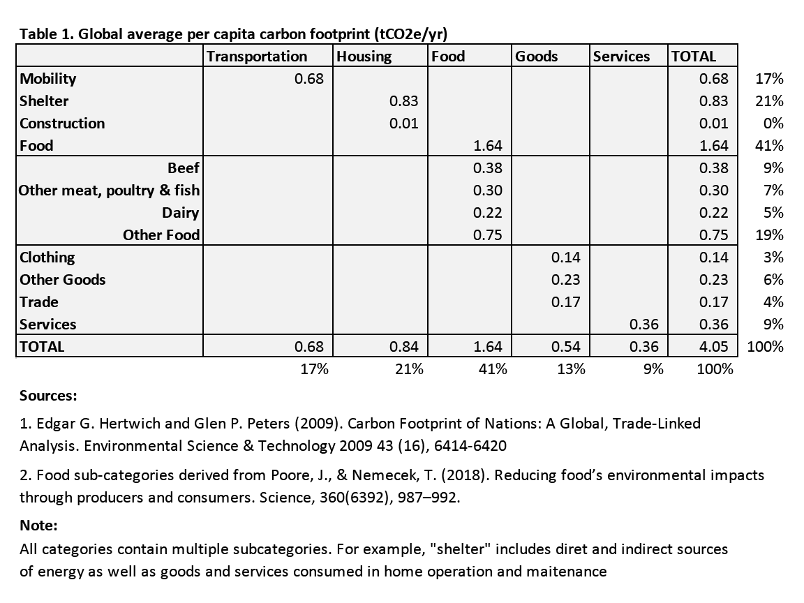
The results of that study for the average global household are shown in the table below. I have further broken out the carbon footprint of beef, other meat (including poultry, eggs & fish), dairy and other food using the composition provided by Poore and Nemecek. Globally, 17% of household carbon footprints are from meat, poultry & fish (15% excluding fish & eggs) of which 9% are from beef alone, 5% are from dairy, and 19% are from all other food, totaling 41% for all food. By comparison 17% are from all household transportation, including the full life cycle of motor vehicles, air travel and all other transportation modes. After food, “shelter” is the largest category of carbon footprints (21%), which can be further broken down into direct and indirect emissions from electricity, heating and cooking fuels, as well as goods and services for household maintenance and operation. Thus, from a full life cycle perspective, meat appears to be the single largest contributor of greenhouse gases emissions globally, and animal products contribute more to household carbon footprints than any other broad category of consumption (transportation, housing, goods or services).
All of this comes with caveats, of course. There is always uncertainty with any analysis, and the study presented here is about a decade old, although it is roughly the same vintage as the FAO studies. A number of MRIO models have been developed in recent years and consumption-based GHG inventory methodologies continue to improve and achieve higher spatial resolution.
Our own work at CoolClimate on consumption-based GHG inventories for the United States, and California demonstrates wide variation in the size and composition of carbon footprints within and between cities. The screenshot of our mapping and policy tool for California below shows a 5x difference between the size of carbon footprints at neighborhood (block group) scale within just the San Francisco Bay Area. We found much larger differences investigating the carbon footprints of zip codes for the entire United States in our 2014 paper in ES&T.
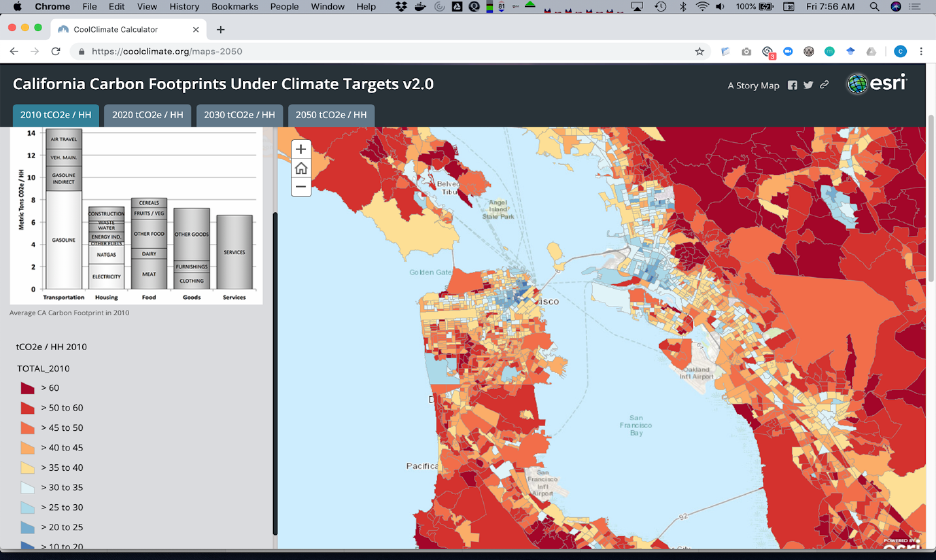
Figure 1. Screenshot of CoolClimate carbon footprint map of the San Francisco Bay Area. Colors scale from dark blue (10-20 tCO2e) to red (>60 tCO2e) per household in 2010
Perhaps the biggest benefit of carbon footprints is as an educational tool to engage individuals and households in climate action. The CoolClimate Calculator allows individuals or households to calculate their complete carbon footprints, compare their results against similar users in their community and create climate actions plan to reduce their emissions. The location benchmarks are built into the tool as defaults, allowing individuals or policymakers to see which aspects of carbon footprints matter most.
Interestingly, the relative composition of carbon footprints for college students often does not look much different than the global average. The screenshot below is for the average household (of 2.5 people) in the 94704 zip code, where mostly students live in Berkeley, California. The San Francisco Bay Area has very clean electricity and mild climate so emissions from energy are quite low. Households in this zip code who own cars do not drive them much relative to most neighborhoods. For students who do not own a car and live in shared housing, animal products are very likely the largest contributor to their carbon footprints.
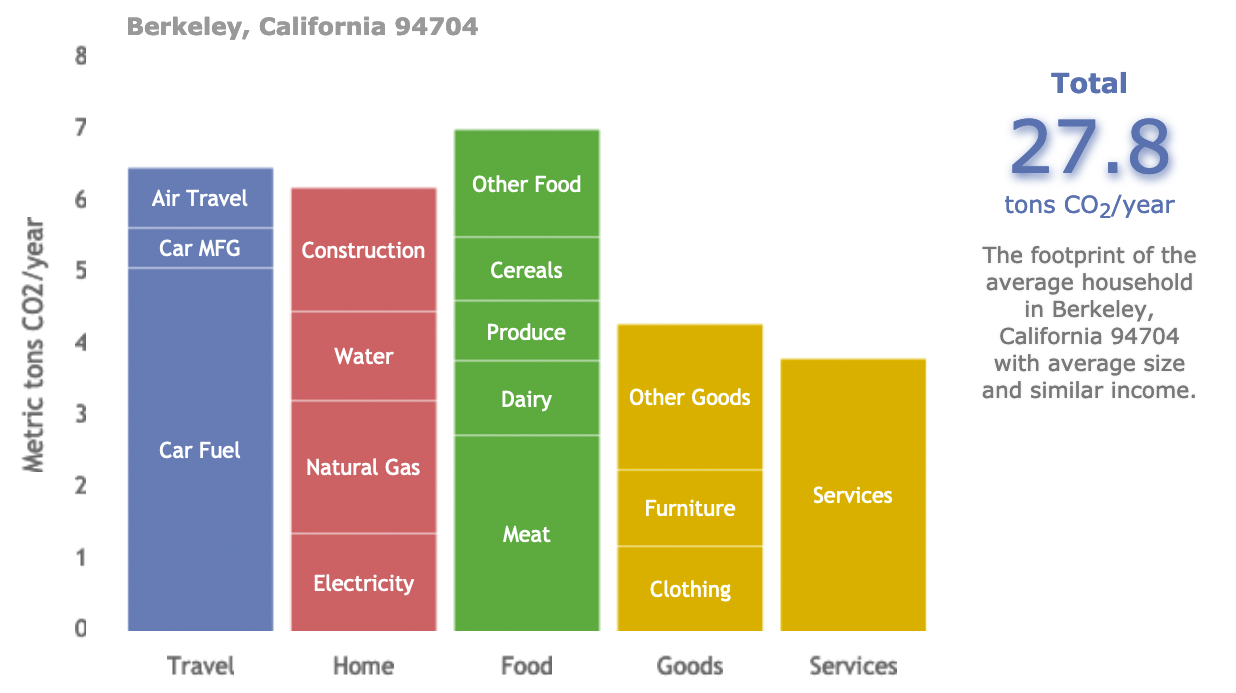
Figure 2. Screenshot from the CoolClimate Calculator. Data in bar chart are for the average household in zip code 94704 in Berkeley, CA. Source: Christopher M. Jones and Daniel M. Kammen, Spatial Distribution of U.S. Household Carbon Footprints Reveals Suburbanization Undermines Greenhouse Gas Benefits of Urban Population Density. Environ. Sci. Technol., 2014, 48 (2), pp 895–902.
As I mentioned on a recent podcast interview, the largest contributors to U.S. carbon footprints are “cars, coal, cows and consumption, roughly in that order.” Motor vehicles are by far the largest source of emissions on both production-based (~40%) and consumption-based (about 35%) approaches. In states with coal-fired electricity, emissions from household energy are often larger than transportation and the range of electricity carbon footprints between locations is quite high. In California, for example, electricity accounts for only ~5% of carbon footprints; in the Bay Area it’s 2% and in the East Bay only 1%. Food comes in third (~18%), with about half of those emissions coming from meat and dairy. Of course, energy, transportation, food, goods services...it’s all consumption, so the answer to the title of the blog is consumption is by far the largest contributor to household carbon footprints, no matter the location.
The CoolClimate Calculator has been continually developed for over 15 years now, and it seems to be making a positive impact; however, CoolClimate recognizes that information alone is usually not enough to change behavior. We are proud to be a partner in innovative behavior change programs like the Cool Campus Challenge. In less than two weeks (as of this writing) we have signed up over 10,000 students, staff and faculty who have taken nearly 60,000 actions across the 10 University of California (U.C.) campuses. It’s a simple, fun and social program to activate, educate, motivate and ultimately empower members of U.C. campuses to collectively engage in climate action. I am hopeful that the benefits of this program will extend far beyond the University of California. Only if we address climate change quickly and at large scale will we prevent the worst consequences of climate change. Understanding what contributes most to our own carbon footprints is often a good next step.